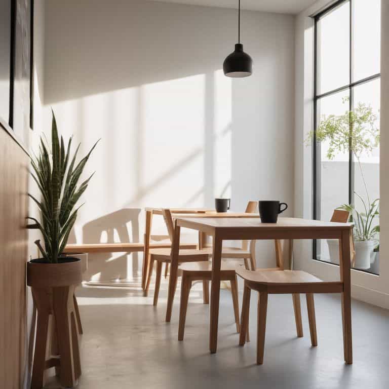
I still remember the first time I walked into a trendy coffee shop in London and was struck by the minimalist aesthetic in branding and design that seemed to permeate every aspect of the space. The clean lines, the empty space, and the carefully curated decor all screamed “modern” and “sophisticated.” But as I looked around, I couldn’t help but feel that something was off. The space felt sterile, lacking a sense of warmth or character. It was as if the owners had taken every interior design trend from the past few years and mashed them all together into a bland, unoriginal mess. I thought to myself, what’s driving this obsession with minimalism, and is it really worth sacrificing individuality for the sake of looking sleek and modern?
As someone who’s spent years studying consumer culture and advising brands on how to stay ahead of the curve, I’m here to tell you that the minimalist aesthetic in branding and design is more than just a passing trend. It’s a cultural phenomenon that reflects our deeper desires for simplicity, clarity, and authenticity. In this article, I’ll be digging beneath the surface of this trend to explore what’s really driving it, and what it means for brands and consumers alike. I’ll share my own experiences and insights, gained from years of working in the industry, to provide you with a no-nonsense guide to understanding the minimalist aesthetic and how to make it work for you. My goal is to give you the real story, without the hype or the fluff, so you can make informed decisions about how to incorporate this trend into your own brand or personal style.
Table of Contents
Decoding Minimalism

As I delve into the world of minimalist branding, I find myself drawn to the simple typography that has become a hallmark of this design trend. There’s something undeniably sleek about a well-crafted logo that relies on clean lines and empty space to convey a sense of sophistication. But what’s driving this obsession with simplicity? Is it a desire to stand out in a crowded marketplace, or a genuine attempt to connect with consumers on a deeper level?
I’ve noticed that color psychology plays a significant role in minimalist design, with many brands opting for muted palettes that evoke feelings of calmness and serenity. This is particularly evident in the realm of luxury branding, where minimalism is often used to convey a sense of high-end quality and refinement. The influence of Scandinavian design can also be seen in the use of natural materials and subtle color schemes that add warmth and texture to an otherwise minimalist aesthetic.
As I continue to explore the world of minimalist branding, I’m struck by the effective use of negative space in logo design. By stripping away unnecessary elements and focusing on simple, geometric shapes, designers are able to create logos that are both visually striking and deeply memorable. This approach has been particularly influential in the world of flat design trends, where minimalism has become a key component of a broader visual language that emphasizes simplicity and clarity.
Scandinavian Influence on Branding
As I delve into the world of minimalist branding, I notice a significant Scandinavian influence that has been shaping the industry. The region’s design philosophy, characterized by simplicity, functionality, and a focus on nature, has been widely adopted by brands seeking to convey a sense of sophistication and elegance.
The use of neutral color palettes is a hallmark of Scandinavian design, and it’s no surprise that many brands have followed suit. By incorporating these calming hues into their visual identities, companies can create a sense of serenity and understated luxury, which resonates deeply with consumers seeking a more streamlined and thoughtful approach to design.
Simple Typography in Luxury
In the realm of luxury branding, simple typography has become a staple, conveying a sense of sophistication and refinement. This shift towards clean and elegant fonts is not just about aesthetics, but also about creating a sense of exclusivity and high-end quality.
The use of sans-serif fonts in luxury branding is particularly noteworthy, as it adds a touch of modernity and sleekness to the overall design. By embracing this minimalist approach to typography, luxury brands can effectively communicate their values of understated elegance and refined taste.
The Minimalist Aesthetic in Branding and Design

As I delve into the world of luxury branding, I notice a peculiar trend – the use of simple typography to convey high-end quality. It’s as if the absence of clutter and ornateness has become a status symbol, signaling refined taste and sophistication. This phenomenon is closely tied to color psychology in minimalism, where a limited palette is used to evoke feelings of calmness and serenity. The Scandinavians, in particular, have mastered this approach, incorporating negative space in logo design to create a sense of elegance and understated luxury.
The influence of Scandinavian design is evident in the proliferation of flat design trends in modern branding. By stripping away unnecessary embellishments, companies can project a sense of modernity and sleekness, which resonates with the younger demographic. This aesthetic is not just limited to visual identity; it also permeates the overall brand narrative, emphasizing luxury branding with minimalism as a way of life.
In this context, the strategic use of simple typography in branding becomes a powerful tool for conveying a brand’s values and personality. By opting for clean lines and sparse typography, companies can create a sense of intimacy and exclusivity, drawing the customer into a world of refined sensibilities. As I explore this trend further, I’m struck by the ways in which Scandinavian design influence has reshaped our understanding of luxury and sophistication, one elegantly designed logo at a time.
Color Psychology and Negative Space
As I delve into the world of minimalist branding, I’m struck by the power of restraint in color psychology. A limited palette can evoke feelings of sophistication and elegance, while also conveying a sense of calmness and serenity. The use of negative space is also crucial, as it allows the eye to focus on the essential elements of the design.
The strategic use of monochromatic colors can create a sense of cohesion and visual flow, drawing the viewer’s attention to specific elements of the brand’s message. By balancing negative space with subtle color accents, designers can craft a visual narrative that is both understated and effective, ultimately enhancing the brand’s overall aesthetic and emotional resonance.
Flat Design Trends in Modern Branding
As I delve into the world of modern branding, I notice a shift towards simplistic visuals that prioritize function over form. This aesthetic is reflected in the use of flat design trends, which have become increasingly popular in recent years. The absence of clutter and unnecessary elements allows brands to communicate their message more effectively, creating a sense of clarity and sophistication.
The rise of minimalist interfaces has also contributed to the proliferation of flat design trends in modern branding. By embracing a more streamlined approach to design, companies can create a cohesive visual identity that resonates with their target audience. This, in turn, can lead to increased brand recognition and customer engagement, as consumers are more likely to respond to clean and intuitive designs.
Embracing the Void: 5 Essential Tips for Mastering the Minimalist Aesthetic in Branding and Design
- Edit Ruthlessly: Remove any element that doesn’t serve a purpose, because in minimalist design, every detail counts
- Typeface as Personality: Choose a simple, high-quality typography that reflects your brand’s voice and values, and use it consistently
- Neutral is Not Boring: Use a restrained color palette to create a sense of calm and sophistication, and balance it with thoughtful negative space
- Flat is Not Flatlining: Incorporate subtle textures and gradients to add depth and visual interest to your designs, without sacrificing simplicity
- Let Context Speak: Allow your brand’s message and values to shine through the minimalist aesthetic, rather than relying on clutter and noise to convey your point
Key Takeaways: Unpacking Minimalism
Minimalist aesthetics in branding and design are driven by a cultural desire for simplicity and clarity, reflecting a broader societal shift towards valuing authenticity and substance over extravagance
The effective use of simple typography, Scandinavian influences, and thoughtful color psychology can elevate a brand’s image, conveying a sense of luxury, sophistication, and modernity that resonates with discerning consumers
By embracing the principles of minimalist design, including the strategic use of negative space and flat design trends, brands can create a visually striking and cohesive identity that not only stands out in a crowded marketplace but also fosters a deeper connection with their audience
Unpacking the Essence of Minimalism
The minimalist aesthetic in branding and design isn’t just about stripping away the excess – it’s about distilling the essence of a brand down to its most potent, unadulterated form, revealing the underlying cultural forces that drive our desires for simplicity and clarity.
Sloane Palmer
The Lasting Impact of Minimalism

As we’ve explored the minimalist aesthetic in branding and design, it’s clear that this trend is more than just a passing fad. From the use of simple typography in luxury branding to the influence of Scandinavian design principles, minimalism has become a cultural phenomenon that reflects our desires for clarity, sustainability, and authenticity. By embracing negative space and flat design trends, brands are able to communicate their values and messages more effectively, cutting through the noise of a crowded marketplace.
So what’s the ultimate takeaway from this quiet revolution? As we move forward, it’s essential to remember that good design is not just about aesthetics, but about creating a deeper connection with our audience. By embracing the principles of minimalism, we can distill our messages down to their essence, revealing the true essence of our brands and forging a more meaningful relationship with the people we’re trying to reach. As I always say, the next big trend is often hiding in plain sight – and for now, minimalism is the north star that’s guiding us towards a more streamlined, more sustainable, and more human-centric approach to branding and design.
Frequently Asked Questions
How do brands balance the desire for a minimalist aesthetic with the need to communicate complex information to their audience?
For me, it’s all about striking a balance between visual simplicity and narrative depth. Brands can achieve this by using intuitive typography, subtle animations, and carefully curated content that unfolds gradually, rather than overwhelming the audience with too much information at once.
Can a minimalist brand identity be effective for industries or companies that are traditionally associated with bold or bright visuals?
I’d argue that a minimalist brand identity can be a savvy move even for industries known for bold visuals – think about it, a stripped-back approach can be a refreshing respite from the usual sensory overload, and can actually help such brands stand out in a crowded landscape.
What role does cultural context play in the interpretation and effectiveness of minimalist design in branding and advertising?
Cultural context is everything when it comes to minimalist design – it can be sleek and sophisticated in one culture, but cold and uninviting in another. I’ve noticed that Scandinavian minimalism, for instance, resonates deeply in Northern Europe, while in other regions, it may be perceived as lacking warmth or personality.


